 Scrolling Stories
Look and motion
Look, alignment, fade, motion, how a video plays, transitions, text animation, and fine-tuning with keyframes.
Look settings are on a beat's Look tab, and settings the scroll changes are on its Motion tab. Both are described under The beat panel. Pace, motion, intensity, transition and text animation start from the story panel's Defaults for every beat. A beat's own value wins.
Look and theme
A look is a tint, a shade or a filter laid over a photo: Golden hour, Vignette, Bottom shade and others. Choose one for a beat with Look on its Look tab. Story look in the story panel lays one over every photo.
The Theme sets the fonts and text colours for the whole story, and the default motion and transition. A theme never sets pace or text animation, so changing it never changes a finished story's timing.
Face, under Font on the Look tab, gives a beat or a page a face of its own. The faces on offer for a page can differ from a beat's. If a face you used is no longer offered, the story keeps it, and the list says No longer offered beside it.
Every face in the list draws wherever the story is read here or on your own domain, and in Read as a page, the PDF and the EPUB. A story placed on another website with the script snippet draws only these faces: Lora, Merriweather, EB Garamond, Cormorant Garamond, Libre Baskerville, Fraunces, Playfair Display, DM Serif Display, Cinzel, Bebas Neue, Inter, Manrope, Oswald, JetBrains Mono, Caveat, Permanent Marker and Great Vibes. Any other face is set there in a similar plain face instead.
Alignment
Alignment is where a beat's lines sit in the column its words take: Left, Centre or Right. It has its own row on the Look tab, above Position, and it is there while you compose for either shape. It moves the lines, never the box.
Until you choose, a Headline, a Title beat and a full-frame embed are centred, and every other beat starts at the left, which is how every story written so far is drawn. The segment already lit is that same drawing, so pressing it is the way back if you want to undo a choice: Centre on those three, Left everywhere else. The choice shows where the words run to more than one line: a wrapped title on Centre puts its second line under the middle of its first.
On an Overlay whose words change partway through, the box fits the words shown at each moment, so Centre centres them on the screen. A card keeps the width its style gives it, and its height follows the words shown.
A Headline, the style a Title beat starts with, breaks a line only where you type one, and it is as wide as its words, so Position puts the words themselves where you choose on any screen. Where a line is too wide for the screen, the whole Headline is drawn smaller to fit. Large words stop at 24 pixels and a smaller line, like the one under a heading, stops at 16, while the rest carry on getting smaller. Only a line still too wide at its smallest wraps at the edge of the screen. Words that change take one size, the smallest any of them needs.
On a Headline, Alignment lines up the lines you typed, and the lines of one too long for the screen where it wraps: Left puts each against the left of the words, Right against the right, and Centre under the middle.
Fade
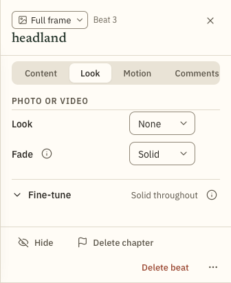
Fade is how solid a beat is drawn, so what is behind it shows through. It is on the Look tab, and has five presets:
- Solid. Drawn as it is.
- Ghost. Half solid the whole way.
- Fade out. Solid for the first quarter, then fades to nothing by the end.
- Fade in. Fades in over most of the beat, then stays solid.
- In & out. Fades in over the first 30%, holds for 40%, then fades out over the last 30%.
To set your own, use Fine-tune below. The row then reads By hand, and Reset fade goes back to a preset.
Motion
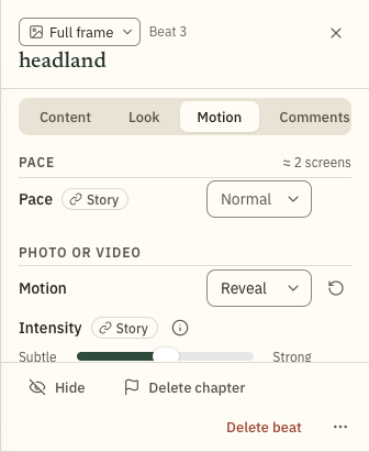
Motion is how a photo moves while the reader scrolls. It is on the Motion tab.
- Still. The photo stays still while the reader scrolls.
- Drift. The photo slides a little slower than the scroll.
- Ken Burns. The photo slowly zooms and pans at its own speed, in or out, like in a documentary.
- Breathe. The photo gently zooms in and out at its own speed.
- Reveal. The photo zooms in as the reader scrolls through the beat.
- Pan. The photo slides across the screen as the reader scrolls, so all of it is seen. Scrolling back takes it back.
- Pan on its own. The photo slides across the screen and back, slowly, so all of it is seen.
Intensity sets how much a photo moves, from Subtle to Strong. It appears only where something moves.
Pan is for a photo the screen cuts off, such as a panorama, or a landscape photo on a phone held upright. Direction, under Motion, is which way the view travels: Left to right, Right to left, Top to bottom or Bottom to top. The photo travels exactly as far as the screen cuts it off that way, from one edge of it to the other. Where nothing is cut off that way, it stays still, and the row says so for the screen you are composing on. A photo can travel one way on a phone and another way on a computer: compose for the other shape and choose its own direction.
A longer Pace slows Pan, because the same journey takes more scrolling. Intensity sets how fast Pan on its own goes, and changes nothing for Pan. A beat chooses Pan itself: it isn't one of the story's defaults, because which way to travel depends on the photo. Readers who turn off motion see the photo still.
How a video plays
A video plays on its own clock until you say otherwise: it starts when it comes on screen and loops, whatever the reader does. On a beat that holds a video, Plays is the first row under the photo on the Motion tab. Choose With the scroll and the video moves only as the reader scrolls: backwards when they scroll back, still when they stop, and at the same frame when they come back to it.
Only a clip up to a minute long can play with the scroll. Choosing it makes a second copy of the video that is built for scrolling, and the copy counts towards your storage: up to about 1 MB for each second of the clip. The row says Preparing… while it is made, and the preview follows the scroll meanwhile. If your plan has no room for the copy or it can't be made, the row says why. Try again asks again, and On its own goes back. The copy goes when you delete the video.
A video that plays with the scroll has no sound, and readers who turn off motion see its first frame. The beat is made long enough to play the whole clip, a screen for every 2.5 seconds, at any pace.
A clip can pan as well. Pan carries the picture across as the video moves, and back when the reader scrolls back, but Pan on its own keeps sliding when the reader stops.
Transition
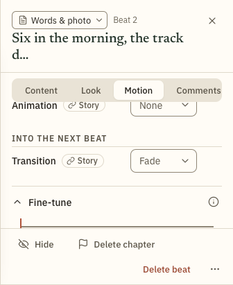
A transition is how one beat gives way to the next. On the Motion tab it is under Into the next beat.
- Fade. One beat dissolves into the next.
- Cut. The next beat appears at once, with no blend.
- Rise. The beat comes up from below and leaves through the top.
- Fall. The beat drops in from above and leaves through the bottom.
- Left and Right. The beat slides in from that side and leaves the same way.
Text animation
Text animation is how a beat's words arrive and leave. Choose one under Animation on the Motion tab. The story panel's Text animation sets one for every beat that hasn't chosen its own, and the starting value is None.
- Rise & fade. The text lifts into place and fades up over the first third, then holds.
- Settle. Drops in from above, goes a little past where it belongs, and comes back to rest.
- Drift across. A slow pass sideways: in from one side, level in the middle, out the other. You choose the direction.
- Wave. The text rides a slow swell as the reader scrolls: one swell per screen, however long the beat.
- Explode. Holds, then accelerates out to a corner and off the frame as the beat ends. You choose the corner.
- Shrink away. The block shrinks toward its own centre and fades as the beat closes.
Fine-tune
Fine-tune is a closed section at the foot of the Look tab and the Motion tab. On Motion it holds the text's keyframes. A keyframe is a point where the text changes position, size or opacity, and the text moves between one keyframe and the next. On Look it holds the fade's stops.
- Scroll the preview to where the change should happen. The strip shows where you are, as a percentage through the words: 0% is where the words arrive, and 100% is where they leave. If the playhead is before the words arrive or after they leave, Fine-tune says so and changes nothing, and Go to the words moves the playhead to them.
- Drag the text in the preview to move it at the playhead. Drag its edges to resize it, the sun badge to fade it, and the Aa grip to change its size. A Headline is as wide as its words, so it has no edges to drag, and no width or height to type. Add another keyframe and the text moves between them. You can also type into the fields: across and down, width, height, text size and opacity. Across and down place the text's box, or the text where there is no box: 0 at the left or top edge, 50 in the middle and 100 at the right or bottom edge. Above 100 or below 0 moves it out past that edge: at 110 it is a tenth of the way from against the edge to just off the screen, and at 200 or -100 it is just off it.
- Keyframe at adds a keyframe that holds the text where it is until the next one, and it reads Remove keyframe on one.
- Move off screen adds a keyframe where the text leaves through the edge you choose, just off the screen, and stays off.
Where you put the text holds on any screen. Position on the Look tab sets where the text comes to rest, with nine places on every beat: text placed in the middle stays in the middle of a wider or narrower screen, and text against an edge stays against it. Text with no animation sits there for the whole beat. On text with an animation, the animation brings it in to that place or takes it away from there, and readers who turn off motion see it there. On text with keyframes of its own, Position adds one at the playhead instead. Where the text has a box, Position places the whole box, so all of it stays on the screen. Text that fills your screen one way looks the same at every place that way on it, and the row says so: on a wider screen it goes to the place you chose, and Size, Smaller steps its style down to give it room on yours. Text dragged partly past an edge is the same share of the way off on any screen.
The fade works the same way. Type a number in % solid, where 100 is solid and 0 is gone. It becomes a stop at the playhead, and with another stop the beat fades between them. If the playhead is outside the beat, Fine-tune says so and changes nothing, and Go to the beat moves the playhead to it.
The still point
Some readers turn off motion in their device's settings. They don't see words animate or a fade play out. They see them held at one place, the still point, so choose a point where the words are easy to read.
Still point is a row in Fine-tune. For text it is a percentage through the words. A fade has its own, a percentage of the beat. A beat can have both.